Build
The Operator's Dashboard: The 12 Numbers That Actually Matter
Most dashboard metrics are noise. These 12 numbers show whether a toll position is healthy, growing, or quietly dying.
July 13, 2026 · 9 min read
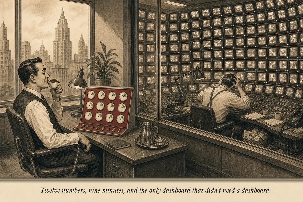
I keep a spreadsheet. One tab. Twelve numbers. Updated every Monday morning.
It takes nine minutes to update. Not because the data is hard to find — it’s sitting in three dashboards I have open anyway. But because I only pull the numbers that answer the questions that matter:
Is the machine working? Is the machine growing? Is anything about to break?
That’s it. Three questions. Twelve numbers. Everything else is noise dressed up as intelligence.
The impulse to track everything comes from the same place as the impulse to optimize everything: the belief that more data means better decisions. But more data usually means more paralysis. An operator staring at 47 email metrics isn’t making better decisions than one staring at 4. They’re making slower ones — or worse, no decisions at all, because the data is pointing in 47 directions at once.
The dashboard doesn’t replace the experiment log. The experiment log is where you test hypotheses and record results over time. The dashboard is the weekly vital signs check — the glance that tells you whether the patient is healthy before you decide what to prescribe.
%%{init: {'theme': 'neutral'}}%%
flowchart TD
    subgraph Q1["Is the machine working?"]
        N1[Weekly Captures]
        N2[Capture Rate]
        N3[Revenue]
        N4[RPS]
        N5[Sequence Conv. Rate]
    end
    subgraph Q2["Is the machine growing?"]
        N6[List Growth Rate]
        N7[Engagement Rate]
        N8[Avg Open Rate]
        N9[Click-Through Rate]
    end
    subgraph Q3["Is anything about to break?"]
        N10[Unsub Rate]
        N11[Revenue Concentration]
        N12[Partner Concentration]
    end
The 12 numbers
I group them by the question they answer.
Question 1: Is the machine working? (Numbers 1-5)
These five numbers confirm that your toll position is doing its fundamental job: capturing subscribers from creator traffic and converting them into revenue.
1. Weekly email captures. How many new email addresses did your landing pages collect this week? This is the input to the entire system. If this number drops, nothing downstream can compensate.
2. Capture rate. Email captures divided by unique landing page visitors. Tells you whether your landing page is converting or leaking. Healthy: 22-30%. Below 18%: something is wrong with the page. Above 35%: you’ve found a particularly strong traffic-message match.
3. Revenue this week. Total affiliate commissions and revenue share payments received or accrued this week. The number you’d report if someone asked “how’s the business?”
4. Revenue per subscriber (RPS). Total monthly revenue divided by total active subscribers. The truth-telling metric. Updated monthly, checked weekly. Healthy: $1.50-$3.00. Below $1.00: system problem.
5. Welcome sequence conversion rate. Percentage of new subscribers who purchase something within the first 14 days (the monetization window). This is your system’s batting average. Healthy: 4-7%. Below 3%: sequence needs work. Above 8%: protect this sequence — don’t experiment recklessly with something that’s working.
This article continues for paid subscribers with Numbers 6-12 (growth indicators and early-warning signals), the Monday ritual for updating the dashboard, threshold alerts, what to do when a number turns red, and the quarterly trend analysis that prevents slow declines from going unnoticed.
Hybrid Content
This article continues for subscribers.
The full implementation — the steps, the templates, the math — is delivered via the newsletter.
Unsubscribe in one click. Useful operator material only. Promotions, sponsors, and partner links will be disclosed.
Build
More on building toll infrastructure?
This article covered one piece of the build dimension. The newsletter delivers a new install pattern every week.
Unsubscribe in one click. Useful operator material only. Promotions, sponsors, and partner links will be disclosed.